Network Analysis in R: Visualizing Network Dynamics
Network analysis is just a moniker for graphically describing network relationships. Whether you are a health official trying to describe the spread of communicable diseases or a business analyst describing the progress of a sales campaign or incentive, network analysis helps others view and better understand a network dynamic. You will need to download the 'network' package for this.
In this post I will be doing the following:
In this post I will be doing the following:
- Provide a simple made up example to understand what network analysis is.
- Expand upon the simple example by adding hyper edges, different shapes and colors, and changing labels for vertices and edges to convey additional information.
- Provide R code with explanations of how to generate these graphics.
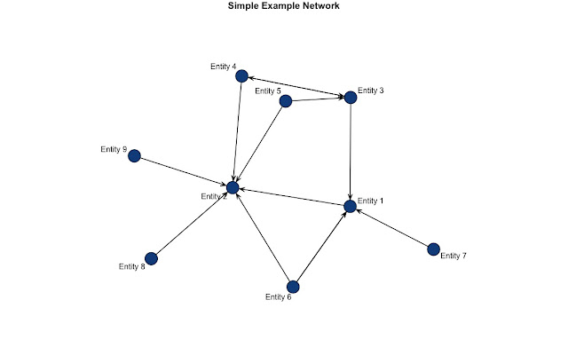
At its simplest, a network analysis is a graphical depiction of the movement of some unit among various entities. In the above graphic, I have nine entities with the arrows or "edges" describing how they interact. This could represent the flow of goods among various businesses, or the movement of animal populations among adjacent locales. If you decided to read this post, perhaps you already have some concept in mind which you could express this way.
Here's the R code for that simple network plot.
You'll notice that there are two vectors of information containing values that describe the movement from one entity to another. The first value from from is one and from to is two. This describes a relationship ship from Entity 1 to Entity 2. You'll notice the 'directed=T' option in the call to the network function. This indicates that I want the "edges" to appear as arrows which specifies a direction to the relationship. Otherwise, there would be an ordinary line connecting the two entities. The 'vertex.sides' argument allows you define the kind of shape you want. For example, a value of 3 there would generate a triangle, 4 a square, and so forth. Large numbers generates a circle. I entered 90, but any large number would generate a circle. With that said, I'm hoping that code seems more straightforward.
Let's take our simple plot and add some additional features to it. I'm going to establish some context around this next example so it'll make more sense. Let's say that each entity is a financial institution and that the edges (arrows) represent transactions carried out by a particular person. You are a forensic accountant and want to visualize the movement of funds from this individual's various accounts. With this graphic we want to distinguish between debits and credits and also show how much money was associated with each transaction.
This means that we need to add hyper edges which are shapes that represent the units passed between entities. In this case, I'll be using triangles to represent the funds transferred between financial institutions. I'll also label those hyper-edges with the quantity associated with each transfer. To accomplish this, I used the following code.
Please note that I am still using the same network inputs as the simple example from before. All I have changed is the hyper option, added labels for the hyper-edges, and shape and color specifications for them, as well. There are 14 transactions (numbers in the from, to vectors) that took place so I added 14 additional arguments in the label, shape, and color inputs. I added a legend to this graph to describe which are credits or debits. This is the legend function in R's base plotting functionality.
The arrangement of vertices are randomly generated (not truly random, of course) so if you don't like how it looks, just rerun the plot function! You will likely end up re-plotting the graphic a number of times to get it to appear without much overlap among all the different labels and edges. There are many different ways you can control the arrangement and look of your network plot. For additional detailed information you can run vignette("networkVignette"), in the console, and it will pull up an article written by the author that goes over many of the features. Again, there are many features I haven't discussed that await you in the documentation.
Feel free to ask me any specific questions at this site. Be aware that there is a nominal $1.50 fee to submit questions. That is because it takes time and effort to respond to your questions.
I hope you found this post helpful and please leave any constructive feedback or requests a topic for a post in the comments.


Comments
Post a Comment